The right hand of Tommie Smith, clad in a black armband, raised in the air at the 1968 Olympics in Mexico symbolised the strength of black Americans, while the black-armed left hand of John Carlos, standing beside him, represented their unity. The two American Olympic medal winners used them to express their non-violent protest against the American social order. The Ukrainian revolution in 2004 was orange, the Iranian revolution in 2005 was purple and four years later green, the Buddhist monks’ revolt in Myanmar in 2007 was saffron yellow. The colour of the revolution is also red, but this is not presentable because red is the colour of blood.
When one looks at it, the first thing one thinks of is blood, although it could also be love, because humans experience love and the colour red in identical ways, explains Dr Anton Trstenjak in his works. Peter Hofstätter has proved this with the Lüscher colour test. When we think of blood red, we subconsciously think of the life force and the danger of bleeding to death. Because it conveys vital stamina and exuberance, blood red evokes eros and sexuality, which is why women wear bright red lipstick and bright red nail varnish.
People also associate the colour red with love and affection, although it is also associated with anger and hatred in a negative sense. Red, also the colour of fire, is the most vital and active of all colours, which is why the composer Franz Liszt is said to have marked full and strong chords with red, and when he thought the music was clear and lighter, he marked it with green.
According to an online advertising survey, people associate the colour red most closely with speed. Although no researcher has ranked it at the top of the list of most popular colours, Dr Trstenjak has it in second place by a wide margin. Red is said to be the colour favoured only by Filipino, Native American and Mexican children. Although the child’s sense of colour is gradually developed from the age of 2 and reaches its peak at the ages of 3 and 4, it is not until the age of 7 that he is able to paint a picture like that of an adult.
And here’s a fun statistic: in America, it was found that drivers are statistically non-negligibly more likely to overtake red cars than cars of other colours. Which cars are overtaken the least often? Green and blue.
Happy and sad colours
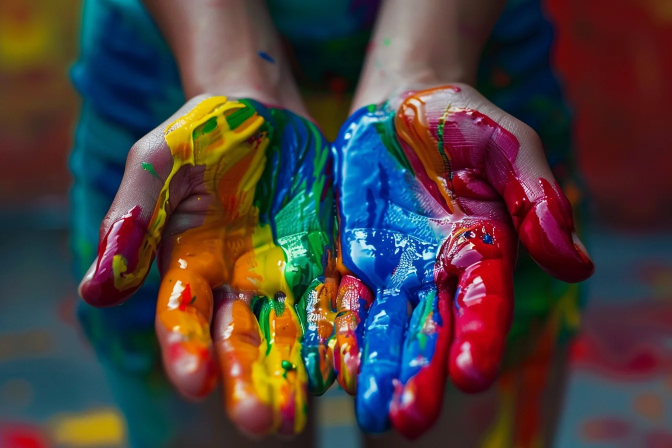
But neither with red nor with any other colour, even those with a punctured memory must not ignore the fact that we never see a single isolated colour, even if we deliberately try to isolate it. Its tone, brightness and saturation are more or less influenced by the colours that surround it, and these are so deeply and biologically connected to man that they affect our mental and physical work, our well-being and our physical and mental health. According to Dr Trstenjak, we are already dependent on light and colour because the visual organ is not only the eye, but also the skin.
So it is not that we see colours as “happy” when we are happy and “sad” when we are sad, but that they also make us happy or sad because they affect us psychologically through their physical properties (tone, brightness and saturation) and physiological effects.
The two gloved hands that Tommie Smith and John Carlos raised in the air in protest on the podium were black. Physically, black represents darkness, physiologically rest or respite, and psychologically sadness and depression. It makes one think of night and is emotionally associated with darkness and mystery.
Like people, colours have their own character. Black, he finds, is uncomfortably imaginative. As long as London’s Blackfriars Bridge was black, Londoners preferred to throw themselves off it to their deaths. When it was painted green, the suicide rate dropped. Yet black is not at the top of the list of the most disgusting colours, in fact it is not even on the list, but it is, if advertising surveys are to be believed, the colour people associate most with quality.
Black is the colour of death, but not everywhere. In fact, it did not exist in Europe until the 16th century and was only introduced as a mourning colour by King Louis XII of France on the death of Queen Anne. The decision was simple, because the Burgundian court had previously worn black clothes to distinguish themselves from the people who wore coloured ones.
In the East, the colour of death is white. It is physically bright and physiologically ephemeral, short-lived because it is “nothing”. Psychologically, it is pure and clear and at the same time cold and distant. Because it is pure and serene in character, it awakens a sense of innocence, virtue and marriage. “Whiteness is the beginning from above, blackness the end from below,” Frieling defined it. According to Trstenjak, people’s attitude towards white is so undefined that it is statistically insignificant in the ranking of the most popular colours.
Its destiny is shared by the grey colour, which is an optical mixture of black and white, so its effects and properties are somewhere between black and white. Because it reminds us of a cloudy sky, it creates the same colour climate as grey autumn or winter fog, which makes its effects unfavourable. A slightly different, but equally unpleasant fog is experienced by victims of borderline personality disorder. That fog is a translation of the English word FOG, which stands for fear, obligation and guilt. These three things bind the victim to the abuser.
But there is nothing hazy about yellow, which is normal because, objectively, it is the first colour we think of when we think of the sun. Yellow stimulates the eye and, through it, the nervous system. Because it has a favourable effect on it, yellow is considered to be the most psychologically cheerful colour, even though it is in itself intellectual and even symbolically philosophical and idealistic.
However, according to the advertising survey, yellow is overwhelmingly the colour people like least, along with orange. According to Trstenjak, African-Americans, Japanese and Africans have the same attitudes towards it. On his list of the most disliked colours, purple and green top the list with 18.8% and 15% respectively, if we look at the statistics, with brown coming in a disgraceful third place with 11%. According to an online advertising poll, the result is the opposite, with green and purple sharing second place in the most popular colours with 14% each, followed by red with 8%. The other colours received so few votes in Trstenjak that they can be statistically ignored.
It is not explained why some people find the colour orange so distasteful. Perhaps it is because it is physically brilliant and fiery, but it does not evoke any emotion and carries even less symbolic message. And green, according to Trstenjak, the second most troublesome colour for people, has quite a bit of that. Because it symbolises truth, faith, trust, rebirth, peace and so on, it makes one feel good to be surrounded by nature.
But its grace is very composite and, like the weather, very vague, Dr Trstenjak points out, and therefore it is not suitable for all people and all nerves. As it is the colour of living nature, it carries life and death within it, and so emotionally it often evokes depression and unpleasant stimuli.
Blue for all people and all times
Blue is on the same side of the colour wheel as green, but even more soothing than it. It is more oriented towards inner peace and calm, but it is also the colour of travel and space. Symbolically, it is supposed to mean wisdom, infinity and immortality, because it is the colour of the sky and water, which makes us think of the sky and the sea.
Her celestial sublimity and calmness make her character conservative, conscientious and lofty, somehow aristocratic and wise, rarely absent-minded, literally silent and distant, aloof, Dr Trstenjak lists. Because of its aloofness, it interests and attracts artists, which is why it is also called the colour of art, although research shows that blue is also the colour of choice for practical men and women. According to Trstenjak, blue is the undisputed favourite colour of both sexes with 45%, but more so of women than of men. An internet advertising poll agrees with the popularity of blue, but says it is preferred by men more than women.
Adults who like the colour blue are considered to be so-called cautiously shy, but blue fabrics are said to be the most permeable to the chemical effects of light. Black is the least.
Violet is related to blue and therefore closest to it in character and effect, but to an even higher degree. Its character is quite subdued and even more sublime, aloof and aristocratic, explains Dr Trstenjak. It awakens in one the thought of violets and precious stones, and emotionally it is in dignified mourning. Symbolically, it tends to erase the past, i.e. to repent, recant and atone.
But there is no regret in the purple colour, the purple’s sister colour, because it is symbolically dignified and quite mysterious, and it also tends towards mystery emotionally. Its opulence and dignity are largely rooted in the past, when it was still expensive and rare as a colour.
Brown, although it is the most ephemeral colour next to yellow, is quite common, pleasant and so conservative as to be uninteresting even to researchers. It is the colour that makes time pass most quickly, explains Dr Trstenjak. Because it is a mixture of warm and cool colours, it is soothing but not soporific, and because it is the colour of the earth, which is in the female lap, it is preferred by women rather than men.
Healing colours
Both sexes are said to prefer warm colours to cool ones throughout their lives. Cool colours are short-wave with blue and green tones, while warm colours are long-wave with red, orange and yellow tones. The differences between colours are also reflected in their chromotherapeutic power.
The colour red thus generates heat. Because its near-infrared heat rays penetrate deep into the tissues of the human body, it increases muscle tension, quickens the heartbeat, raises blood pressure and speeds up the rhythm of breathing. As a result, it is the colour not only of physical but also of mental vitality and activity.
Green, as the colour of plants and living nature outside, is calming and hypnotic. It lowers blood pressure and dilates capillaries. It gives rest to the mind and is effective in calming nerves, insomnia and severe exhaustion. It alleviates neuralgia (nerve pain) and migraines, balances the mind and is the colour of patience.
Blue is thought by some to raise blood pressure by constricting capillaries, while others find it calms the heart and reduces respiratory rate. Like violet, it raises inner responsiveness and leads to calmness and tranquillity. Purple has an effect on the heart and lungs and increases the body’s resistance, making it even more calming than blue. Purple? Related to purple, it is calming and somewhat melancholic, but its quality changes as soon as it shifts to another tone.
Yellow in certain shades calms the nerves, which is why it is used in the treatment of psychoneurosis. Orange speeds up the blood’s heart rate but has no effect on blood pressure. It can be calming or arousing. As such, it speeds up digestion and running, so it is suitable for furnishing dining rooms and similar areas, advises Dr Trstenjak.
People with different conditions also have their favourite colours. People with low vision are particularly fond of yellow. Schizotypal or inward-looking people prefer dark and cool colours, cyclothymic or environmentally-oriented people red and melancholics blue. No information is available for phlegmatics.
Epileptics, regardless of age and gender, prefer the signal colour red, followed by blue, and only in third place by green. They reject unwritten colours because they associate them with unfavourable emotions. Schizophrenics, who are predominantly ‘disengaged’, need to be influenced by warm signal colours because they promote contact with the world. Patients who are under pressure, have high blood pressure, febrile illnesses or are mentally tense should be in an environment with cool colour tones that increase space and give a feeling of relaxation and spaciousness.
H. Wohlfarth studied the effect of coloured light on autonomic nervous processes. He found that short-wave light lowers blood pressure and inhibits pulse and respiration, while long-wave light increases blood pressure and increases pulse and respiration. He also found that the effect of light also depends on one’s emotional relationship to light and colour. Colours can also have a negative effect on human autonomic functions, although nothing is as unpleasant as the alternating light irritation that causes epileptics to have a seizure with a flashing light.
People with a poor autonomic system are more tense after going to the cinema than before, and the autonomic system can also be affected by prolonged TV viewing, which tends to make people’s eyes hurt and make them feel restless. A single colour, however, is enough to make a person completely pass out from food.
A Swedish colour expert invited about 20 guests to lunch. They were all familiar with colours. In the middle of the lunch, he switched on purple lighting to ‘colour’ the dishes: the meat turned purple as if it was already decomposing, the asparagus was blood red … All present were passed by on the run. Cutlery was put away, one of the guests became so sick that she had to leave the dining room. The relaxed conversation stalled and so on.
When the host switched off the unpleasant light and told the guests that they were only part of the experiment, everyone’s appetite returned and the mood was pleasant again. Inappropriate colour on a box or bottle can significantly reduce the quality of a merchandise in the eyes of the consumer, Dr Trstenjak warned advertisers, but they know very well how to use colour to sell fog, and also that people experience colour subjectively, so they can never reliably find one that will appeal to all potential consumers.
We have also long known that colours can be used to create a space that is either oppressive or relaxing, or the opposite, of course in combination with the right colour environment, because no colour works in isolation. Colours are also inseparable from the senses, such as touch, although the strongest interaction of all the senses is said to be between sight and hearing.
Colour is also inextricably linked to form. In an experiment, Karl Duncker cut a piece of green fabric in the shape of a tree leaf and illuminated it with strong red lighting. Although the colour changed, those looking at the object still had the impression that the leaf was green. Then he cut the same green piece of cloth into the shape of a donkey and placed it under the same light. Now the participants in the experiment could no longer see the green donkey, proving that the object’s shape motivated the colour. This is why, for example, people in museums and elsewhere try to observe and ‘see’ objects with their hands and ears, because all our senses are involved in evaluating the colour world.
Fashion
When it comes to colour, each person has their own individual taste, which is not always in line with the basic laws of colour. The American psychologist Bruner even says that every human being has a certain colour “ready-made” in him or her, or rather that every human being is ready for a certain colour. It is the colour into which he puts his emotions and experiences, which is why we talk about every colour expressing emotions, even though in reality it does not, of course.
And yet, we are also willing to give up our colour. The fastest way to do this is through our environment, or rather, through fashion. If someone dresses in very discreet colours, it means they are adapting to the community, explains Dr Trstenjak. If he is dressed in colourful and vibrant colours, he is expressing his individuality, which sets him apart and raises him above the average. But here there is a kind of tension and competition between the individual and the environment: most people follow the colour of fashion and, so to speak, blend into society. As a result, she does not attract attention and therefore, even if she is fashionable, she is a type of the average person, or even a human mass, as Dr Trstenjak calls it.
Uncoloured and unwritten is always a sign of mediocrity, but like any rule, it has its exceptions. Some people stubbornly keep their personal or favourite colours and do not care about fashion, thus outwardly separating themselves from the average, fashionable community. “That’s why fashion stigmatises them with freaks and oddballs,” explains Dr Trstenjak. Others stick to modest and unwritten colours, not to lose themselves in the masses, but to avoid the special external attention of others. Because they do not want to emphasise their exterior to the detriment of their inner personal depth, Germans call such people “the essential man”.
It is generally believed that women are greater followers of fashion than men, but Dr Trstenjak’s findings contradict this. Women are more emotional and more attached to our colours, which makes them harder to give up. The colour of our clothes expresses our individuality and women emphasise it more than men.
Men tend to be more indifferent to their colours, so they are either monochromatic or more likely to change their colour for one dictated by fashion. According to Dr Trstenjak, they also prefer patterned dresses more than women, although both women and men prefer solid-coloured dresses.
However, because fashion is masterful, it is difficult for a person to remain fashionable and individual at the same time, if for no other reason than that he is limited by the choices available to him, but he can express his individuality imaginatively through the colour combinations of items of clothing and accessories, such as belts, shoes and handbags.
But we can’t judge a person’s favourite colour by their clothes. According to Dr Trstenjak, in one survey, 46% of men and women chose blue as their favourite colour, and 86% of them said that they resist fashion trends and stick to their colour. So you might expect them to actually wear blue clothes, but they don’t. Why?
Because the colour of a dress depends not only on which colour we prefer, but also on other personal and objective factors. For example, the choice of colour is influenced by habit and habituation, and we soon get tired of it. When it comes to clothes, we also decide on a colour based on our body shape, size, obesity, personality type, whether introverted or extroverted, nationality, etc. The colour of a garment also depends on why one wears it, the job one is doing, the time of year, etc.
The choice is also influenced by the material: for example, the red colour of velvet or silk is quite different from the same colour tone of a pair of trousers. Therefore, the authenticity of an item, whether it is original or fake, is a key factor in whether we like a colour or not.
At the same time, one can follow fashion with cuts, tastes and styles of dress, while keeping one’s colour whatever the colour of fashion. In any case, he is in constant conflict with his environment, explains Dr Trstenjak: he no longer thinks, feels, wants or decides for himself. The environment makes beautiful what was intolerable and unacceptable to him only yesterday and ugly what was attractive and beautiful to him only recently.
Hence the expression that fashion is created because, without any real basis or reason, we create not only a new pattern, but also a new notion of beauty, attractiveness and value, virtually from scratch. For Dr Trstenjak, the culmination is that people accept as irreplaceable even the absurdities created by fashion, even though they are still aware that these are basically absurdities and not the point.
Here, Dr Trstenjak continues, the man of contemporary fashion creativity finds himself in the psychological state of a hypnotized person who obeys everything, even though he knows it is stupid. This is not only due to the dictatorship of industry, but also to man’s need for change, which quickly leads him to get tired of the same patterns and colours, and to buy new ones that the fashion industry tries to sell him. And the circle is complete.
The ultimate goal of a balanced personality is thus to reach the golden mean in the man-colour-fashion triangle, always somewhere between the dictates of fashion and the emphasis on one’s own personality. In this way, he never dilutes his personality, but at the same time he is not considered a freak in a crowd of equals.